How did Aston Martin get its wings? And what have scarab beetles and tractors go to do with it? We chart the evolution of an icon.
The more things change, the more they stay the same.
For over a century, Aston Martin's passion for progress and determination to reach new heights – to keep climbing – has remained undimmed and, in that time, the Aston Martin logo, incorporating contemporary cues from each era, has evolved into an instantly recognisable icon.
A distillation of a company and what it stands for, a good logo can tell you a lot – but, sometimes, its story can tell you even more. As Aston Martin launches its bold new brand identity, and updated iconic wings, we look back at the history of this iconic marque.
Luxury meets performance
Eager to build the fledgling Aston Martin brand, co-founder Lionel Martin didn't just aspire to compete with his rivals, he sought to make a different kind of car: a luxury sports car.
With an interlocking 'A' and 'M' in dark green – a nod to British racing green – and its circular, button shape, the original logo was inspired by those of preeminent luxury car brands of the early 1920s. Simple yet sophisticated, the design was led by Lionel's wife, Kate Martin, and exuded elegance and style.
Apart from the Coal Scuttle, the very first Aston Martin and a car raced by Kate herself, the logo was applied to every Aston Martin from 1920 to early 1927, including our first Grand Prix car, TT1, which after being sold by the team became affectionately known as 'Green Pea' owing to its colour and Grand Prix – or 'GP' – racing heritage.
Winging it
The Roaring Twenties brought more than flapper dresses, frivolity and a cartoon mouse by the name of Mickey – the Aston Martin brand got its wings for the first time.
Technological advances led to milestones in aviation that captured public imagination, such as the first non-stop transatlantic flight, and brands sought to capitalise on people's fascination with flying. Any car company with a link to aviation made it known and even those that didn't alluded to possible connections with the industry.
Motivated by this trend, 1927 saw the introduction of the first iteration of the wings that would become synonymous with Aston Martin. The wings symbolised speed, and the 'A' and 'M' of the original logo were replaced with the company name – stylised so that the centrally positioned 'M' connected with the horizontal elements of 'T'. The designer remains a mystery to this day.
Looking sharp
The beginning of the 1930s saw the wings take on a sleeker, more dynamic sweep with a sharper outline – but the logo still largely resembled its predecessor.
New beginnings
Simpler, straighter and modern, 1932 was the year the logo took the form most people associate with Aston Martin. The wings acquired feathers, while the company name was elegantly inscribed in silver within a centrally positioned black rectangle.
During the 1930s, Egyptology became increasingly popular. Ancient Egyptians saw the scarab beetle as an extension of the sun god – it signified new beginnings. Inspired by this, and as a nod to the restructuring of the company's ownership, the logo was designed by racing driver and The Autocar editor Sammy Davis.
The badge was first seen on the Aston Martin LM1 racer, which Sammy adapted to become his everyday driver, before it began to appear on marketing materials and, eventually, production cars.
A new addition
After more than two decades, the logo designed by Sammy Davis was revised to include the now legendary David Brown name and fitted to all production road cars.
After acquiring the company in 1947, David Brown introduced the revised logo as a car badge from 1954 – around the time when car production was transferred to his tractor factory. The logo was gradually fitted to all models and remained on the cars when production returned south to Newport Pagnell.
The David Brown name was removed when he sold Aston Martin Lagonda in 1972.
Evolution, not revolution
The wings evolved further in 1984: simplified and modernised for a more refined and elegant look.
The 'Aston Martin' inscription was enlarged and, although they were extended horizontally, the height of the wings was reduced.
This incarnation of the logo would stay with the company for almost two decades.
A new era
The launch of Aston Martin's new global headquarters, a state-of-the-art production facility situated on a former RAF V-bomber airfield in Gaydon, heralded a new chapter in the marque's illustrious history and the wings were modernised again.
Updating an icon
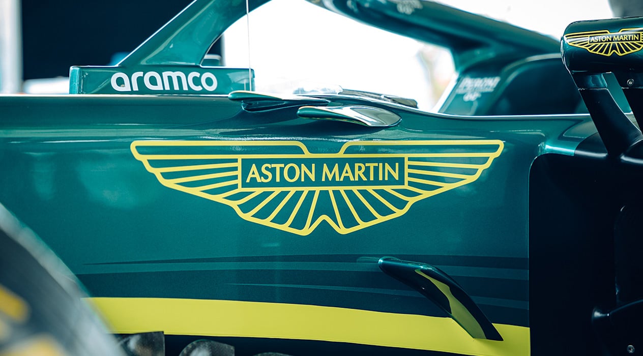
Created in collaboration with acclaimed British art director and graphic designer Peter Saville, and building on Aston Martin's return to Formula One, the latest update to the iconic wings marks the next phase in the evolution of the Aston Martin brand.
In physical form, the new wings badge design is hand-crafted by artisans in Birmingham's jewellery quarter and will be first applied to Aston Martin's next generation of sports cars from 2023.
Related content
Racing Green takes pole position as the most popular Aston Martin colour choice
Read more
Introducing Ai.lonso
Read more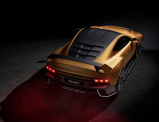
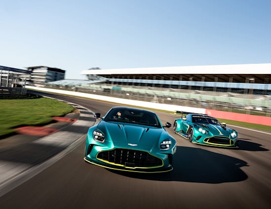
Valiant: An extreme collaboration between Fernando Alonso and Aston Martin
Read more
Aston Martin returns to Le Mans with two Valkyrie LMH hypercars in 2025
Read more
Revealed: The LEGO® Speed Champions Aston Martin Aramco F1 car
Read more
This is art.
Read more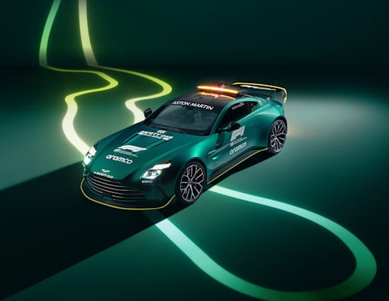
Fastest ever Aston Martin Vantage announced as latest Formula One Safety Car
Read more
Race to road: Aston Martin reveals performance trilogy
Read more
60 years of an icon: the Aston Martin DB5
Read more
Valour. Celebrating 110 years of Aston Martin with brutish power and cutting-edge technology
Read moreAmplify your fan experience
From exclusive collabs to once-in-a-lifetime prizes, I / AM DROPS is a series of unique and ultra-limited moments and fan experiences.
Sign up for I / AM or sign in to unlock.